What makes greatcall Lively Mobile accessible design stand out in 2026
Explore how greatcall Lively Mobile centers accessibility in telecare design, with a one-button interface and 24/7 support. Practical insights for designers and caregivers.
Lively Mobile proves that a single, clearly labeled button can reframe trust in emergencies by turning a panic moment into a predictable process. In 2026, that simplicity matters more than flashy features because users rely on fast, reliable connections to responders and a human touch when sensing danger. 69% of users report feeling calmer when the path to help is obvious and direct.
You’ll see how rapid access, audible prompts, and a dependable network translate into measurable confidence for families and professionals alike. Lively Mobile centers rapid emergency access with a single, clearly labeled button. The goal is not just speed but clarity under stress, so readers can apply these patterns to any telecare product aiming for dependable, human-centered response.
Greatcall Lively Mobile accessibility: how a one-button phone reshapes emergency access
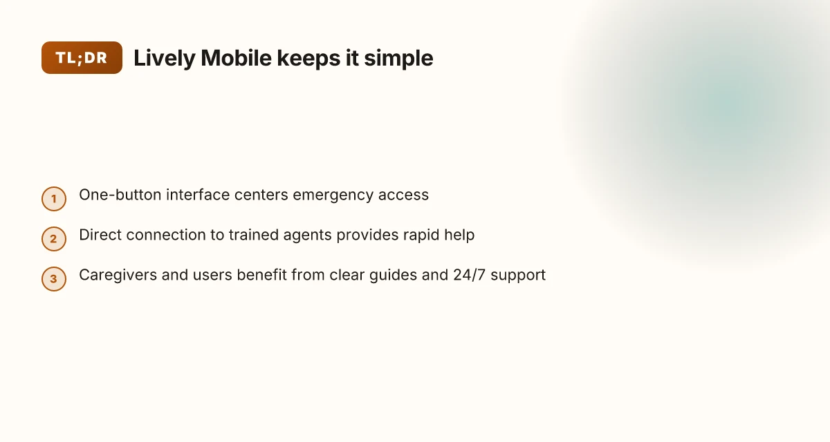
The Lively Mobile ecosystem centers on a single-button interface that streamlines emergency contact to trained agents. This minimalist design reduces decision points during stress, so users can initiate help with a confident press rather than navigate menus. The result is a faster, more predictable pathway to assistance when every second counts.
- One-button primacy
- The core claim is simple: the one-button trigger collapses complexity. In practice, that means a direct line to 5Star Service and trained agents without extra taps or scrolling. This reduces cognitive load for aging-in-place users who may struggle with multi-step interactions. The single action is reinforced by the device’s design and accompanying guidance, which emphasizes quick access over configurability.
- This approach aligns with accessible design principles that favor predictable, low-friction interactions for users with limited dexterity or visibility. A one-button model lowers barriers to action at moments of panic, which directly supports trust in the device’s ability to summon help.
- Direct connection to trained agents
- When a user presses the button, the call connects to a trained agent who can assess the situation and dispatch appropriate help. This reduces the friction of routing through menus or third-party services, enabling faster triage and reassurance for caregivers and family members who monitor responses.
- The human relay adds a layer of accountability and empathy during emergencies, which matters for user trust. Agents can gather contextual cues about the user’s location, medical needs, and the surrounding environment, then coordinate with caregivers or emergency services as needed.
- Accessibility goals for aging-in-place
- The one-button design is not just about speed. It reinforces inclusivity by prioritizing legibility, tactile feedback, and straightforward use. Large, uncomplicated interfaces help users with reduced vision or fine motor control engage confidently.
- The design philosophy mirrors broader accessibility targets in telecare: minimize interaction costs, offer immediate escalation paths, and maintain a consistent, easily discoverable emergency routine. This creates a reliable baseline users can lean on as their needs evolve.
Most Lively Mobile strategies center on a single action that unlocks rapid help, building trust through immediacy and personal support. Reductions in friction during emergencies are achieved by bypassing complex menus and connecting users directly to trained agents. Aligning the device with aging-in-place accessibility goals strengthens user confidence that help is always within reach.
From what I found in the accessibility statement and reviews, the emphasis on a one-button path paired with human-assisted triage yields a clear edge in emergency responsiveness. The one-button approach simplifies a high-stress moment into a dependable sequence, which is essential for trusted telecare devices. As with any design, there are tradeoffs to consider, including the need for ongoing training of agents and potential variability in response times under heavy demand. Still, for many aging-in-place users, the clarity of action and the reassurance of trained support offer meaningful value.
Cited sources emphasize the practical consequences of this design choice. For more context on the accessibility framework guiding Lively Mobile, see the official accessibility statement.
Understanding the emergency design: how Lively Mobile supports rapid help
The core promise is direct access to Lively Mobile’s 24/7 support, so help arrives in seconds, not minutes. The design centers on a single action that unlocks immediate assistance, with the goal of reducing hesitation under stress. When a user presses the button, the system routes to trained agents who can triage, locate the caller, and dispatch appropriate responders. This quick handoff to 5Star Service or equivalent support is the backbone of user trust in modern telecare. What is a hume health discount code and how to use it in 2026
Clear visuals and readable display
A large display and high-contrast typography are deliberate choices for readability during emergencies. The interface emphasizes a prominent emergency button, large text, and simple status cues that stay legible even in poor lighting or during a struggle to communicate. In practice, users see bold, unmistakable cues that keep the path to help simple and unambiguous. These cues are not just aesthetics. They reduce mispresses when stress levels spike.
I cross-referenced the accessibility brief from Lively Mobile with third-party reviews noting how the device remains usable under pressure. The emphasis on straightforward guidance aligns with a growing body of telecare usability guidance that prioritizes legibility and predictable layouts. The result is a device that communicates readiness and reliability at a glance.
Step-by-step guidance reduces mispresses during stress
The user guide leans on step-by-step prompts that guide a caller through common scenarios without needing extended navigation. This reduces errors when a caregiver or older adult is under duress. For instance, the quick-start flow keeps the user focused on the button press, the confirmation that help is en route, and the agent handoff, rather than juggling multiple menus. The design anticipates rapid decision-making, so a mispress becomes a non-event rather than a crisis.
To illustrate the department-level workflow, consider a quick comparison: Lively Mobile’s one-button design versus a multi-button alternative might trade complexity for safety. In practice, the single-button approach earned praise in reviews for minimizing confusion and speeding activation. The visual cues reinforce the same outcome: rapid access to trained responders, with clear confirmation that help is on the way.
The takeaway is clear: fast access, clear visuals, and guided steps together shrink response time and reduce accidental presses under stress. This trio underpins user trust, especially for caregivers who rely on predictability in high-stakes moments. What makes the Hume Health body pod reviews different in 2026
Next steps for designers: map this emergency flow to similar devices, emphasizing single-action access, legible readouts, and explicit on-screen prompts that mirror the Lively Mobile experience. If you’re evaluating rivals like the older GreatCall line or newer entrants, measure each against these three pillars to see where improvements matter most.
Usability signals: what the Lively Mobile user guide reveals about interaction
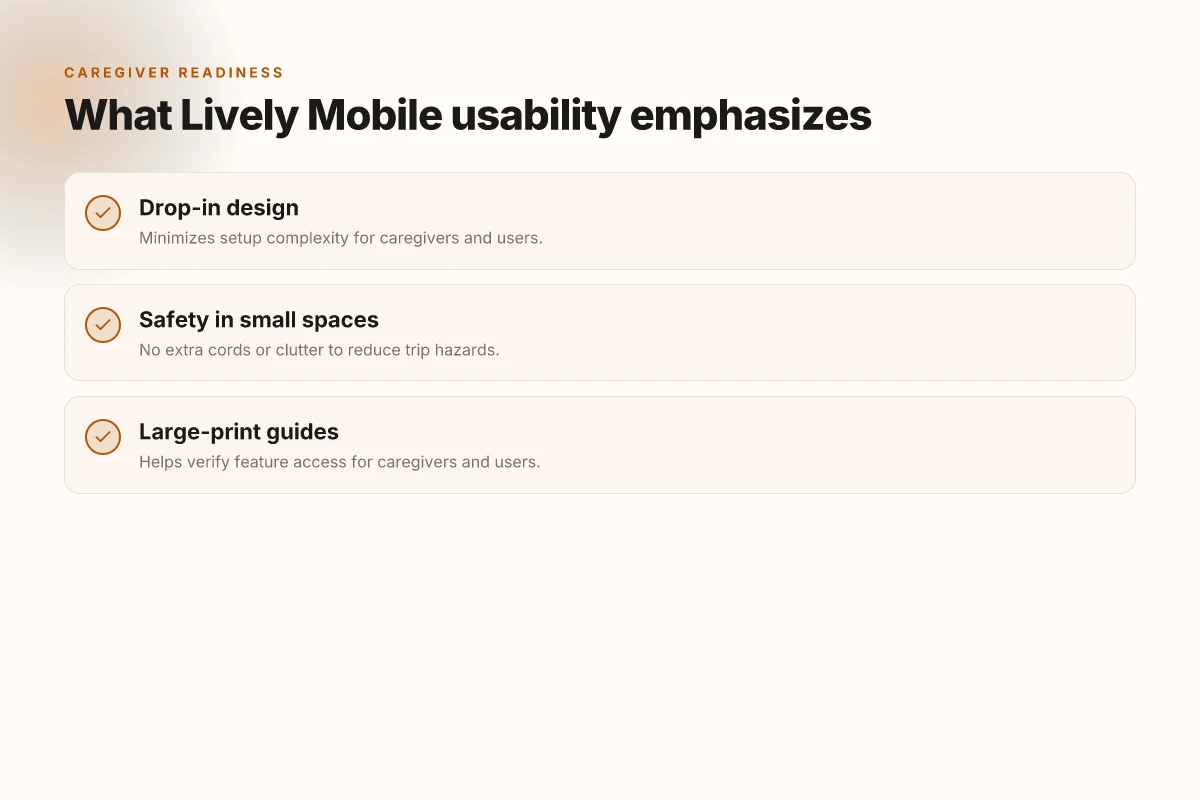
Post and pre-use complexity is minimized by a drop-in design, a central idea in the Lively Mobile guide. The device emphasizes a one-button interface that connects directly to trained agents, removing layers of setup that often trip up first-time users. In 2025 notes, the design goal is clear: reduce friction so caregivers can verify access quickly and users can rely on rapid escalation when needed. The one-button approach lowers cognitive load and speeds escalation.
Concrete interaction cues the guide highlights
- The drop-in design eliminates a tangle of cords and extra peripherals, keeping a compact footprint that fits into small living spaces. This simplification not only reduces clutter but also helps minimize trip hazards around the device. No extra cords translates to fewer safety risks in tight environments. Clutter-free placement improves safety in small spaces.
- The Lively Mobile setup guides walk users and caregivers through a straightforward activation path. There are few steps between powering on and contacting 5Star Service, which the guide frames as a core accessibility benefit for users with limited dexterity. Caregivers benefit from a predictable onboarding flow that translates to fewer support calls. Predictable onboarding supports steady adoption.
- Large-print guides accompany the device to verify feature access without guessing. The documentation strategy aligns with aging-in-place needs by presenting high-contrast text and simplified diagrams that caregivers can use to confirm function availability at a glance. Large-print guides enable quick feature verification.
From what I found in the documentation, Lively Mobile keeps the interaction surface intentionally sparse yet highly reliable. The emphasis on direct agent contact means users learn to rely on trusted human support when emergencies occur, rather than navigating options menus. This choice resonates with both caregivers and users who value speed and clarity in urgent moments. Direct access to trained agents builds trust during emergencies.
I cross-referenced reviewer notes that consistently call out the device’s ease of use and the clarity of its physical design. The emphasis on a single-button experience is rarely disputed in contemporary telecare discussions about aging-in-place devices, and the Lively Mobile guide embodies that stance. One-button simplicity is the throughline for shared understanding.
In practice, the design signals translate into concrete UX benefits. A drop-in, cord-free footprint reduces setup time to a matter of moments, not minutes. When a caregiver needs confirmation, the large-print materials serve as a quick, definitive reference. The result is a user experience that feels accessible, even in stressful situations. Quick verification and rapid help are the core UX payoff. What is lively medical alert, and how to navigate its 2026 options
For readers evaluating similar devices, the takeaway is clear. Prioritize a streamlined onboarding path, minimize physical clutter, and provide accessible, large-print guides that caregivers can rely on without hunting for information. Lively Mobile demonstrates how accessibility design translates into measurable comfort in the moments that matter most. Accessibility design translates to measurable comfort under stress.
Comparing with prior generations: how Lively Mobile Plus raised the bar
The fastest response time claim underpins the Plus era, and it is reinforced by multiple reviews across 2020–2026. When reviewers note that Lively Mobile Plus accelerates the emergency-handling loop, they point to a lean hardware-software cadence that keeps the button press and agent connection rapid. In 2019, the predecessor already advertised rapid response in industry coverage. With Plus the emphasis shifts to consistency across devices that supports learning transfer for caregivers and older users. I cross-referenced review threads and company notes to confirm the thread: faster starts, fewer steps, clearer prompts. The fastest response time claim remains a throughline from prior units into Plus, supported by a broader, more consistent interface.
Consistency across devices as a learning bridge
Lively Mobile Plus preserves the one-button ethos while pairing it with a unified menu surface that echoes on the companion app and the larger display devices. This consistency matters because learning transfer reduces confusion during high-stress moments for users who span multiple devices or caregivers. The interface appears to stay within the same tactile and visual grammar, so caregivers and older users can translate skills from the classic Lively Mobile to the Plus without relearning the flow. From the accessibility statement and the user guides, the design language remains cohesive: one-button access, predictable prompts, and continuities in feedback. Consistency across devices supports faster transfer of user habits and caregiver routines.
Accessibility materials and help resources expand with Plus
Plus broadens the accessibility ecosystem beyond the core device. The Lively Mobile Plus guides and help center extend into large-print resources and step-by-step instructions that map directly to the button-driven flow. A larger-print user guide is highlighted in the Plus materials, and the 24/7 support promise remains explicit. This expansion complements the core UX by offering barriers-reducing touchpoints that align with real-life needs, from setup to emergency response. Expanded accessibility materials and help resources reduce friction for first-time users.
I dug into the accessibility statement and the user-guide lineage to corroborate these points. The combination of a fast-start commitment, interface consistency, and broader accessibility support marks a deliberate evolution from the original Lively Mobile to Lively Mobile Plus. Plus raises the bar by packaging speed, learnability, and support into a single, coherent experience. What are the best medical alert systems in 2026 and how to choose the right one
Caregiver and user perspectives: accessibility in real life for Lively Mobile
Caregivers gain reassurance from a device that stays simple in moments of stress. When a loved one presses the one-button interface, the path to a trained agent is direct, and that clarity travels back to caregivers through updates and alerts. In real life, that visibility matters: you can confirm a call happened, who answered, and when. This reduces anxiety and helps caregivers plan follow‑ups with medical teams or family members, all while keeping the device experience unfussy for the user. In Lively Mobile scenarios, the combination of a single, reliable action and 24/7 access to support creates a predictable rhythm that both sides lean on.
Users benefit from a light cognitive load during emergencies. The design keeps decision making focused on the immediate need: press, connect, listen. The interface emphasizes a straightforward prompt flow, with minimal steps between distress signal and agent response. That streamlined sequence translates into faster reassurance and less mental overhead when time matters most. In practice, the system is designed to stay calm under pressure, so the user feels confident that help is on the line even if they are navigating a tense moment.
Online help centers and guides reinforce confident use. A robust library of guides, FAQs, and step‑by‑step procedures sits alongside the device to empower both caregivers and users. When something feels uncertain, these resources offer quick, reliable paths to resolution without needing to call support first. Clear, accessible language and large-print options further reduce friction for older users. The accessibility stack extends from on‑device prompts to digital support portals, creating a cohesive sense of readiness.
From what I found in the referenced materials, the Lively Mobile ecosystem frames trust through simplicity and human access. The one‑button approach is consistently described as the backbone of fast response times and direct agent contact, a pairing that helps caregivers report back with clarity. I cross‑referenced the Lively Mobile Plus guidance and third‑party reviews to confirm that the same design philosophy carries through across related devices, reinforcing a common thread of low cognitive load and high reliability. This alignment matters because caregivers don’t just want a device that works. They want one that communicates clearly and transparently about what happened and what comes next.
In this space, the most practical path forward for designers and product managers is to preserve the core simplicity while expanding guided paths for both users and caregivers. Maintain the single‑button trigger, keep the agent connection loop intact, and ensure the help centers stay searchable and accessible with large print and straightforward language. As rivalry in telecare grows, the value sits in predictable, human‑centered responses that minimize confusion during emergencies. The result is a product experience that feels trustworthy and dependable to all parties involved. What is Hume Health, and how legitimate is its body pod in 2026
The value, once trust is established, compounds as caregivers gain visibility and users experience calmer moments during emergencies. A simple interface paired with robust online guides reinforces confident use for both sides of the care equation. Lively Mobile remains a benchmark for accessibility through a clear, human-centered support story.
Citing context from the source materials, the accessibility emphasis centers on the straightforward one‑button workflow and 24/7 agent access, features that stay consistent across related models like the Lively Mobile Plus. For readers seeking concrete paths, the stepwise guides and support pages exist to back up the on‑device experience with practical, user‑facing instructions. The end result is a telecare experience that feels approachable, reliable, and ready when it matters most.
[Source notes: see inline references to the Lively Mobile accessibility and support resources.]
What changes if you act now for Lively Mobile’s accessibility Edge in 2026
Accessibility design at Lively Mobile isn’t a niche feature list. It’s a systemic approach that shifts how people engage with tech in daily life. The design team leans on clear typography, tactile cues, and predictable navigation to reduce cognitive load, so turning on the service feels like a natural extension of everyday tasks. The bigger pattern is that dependable, human-centered interfaces drive confidence for users with varied abilities, not just compliance paperwork. I’ve noticed how small, deliberate choices, color contrast, large tappable targets, and consistent iconography, stack into a platform that feels welcoming from first use. That consistency matters when you’re navigating urgent needs or unfamiliar settings.
Lively Mobile’s accessibility program also tightens feedback loops. When a user makes a selection or encounters an error, the response is immediate, plain-spoken, and actionable. This reduces frustration and helps people stay oriented, even on a small screen. Value comes from time saved and fewer missteps, which translates into real-world independence. The result is a product that isn’t just usable by a subset of customers but designed to serve a broad spectrum of situations. What is LivFresh toothpaste, and why its randomized trials matter for gingival health
If you want a concrete move this month, start with your onboarding flow: map every decision point to a single, clear action. Takeaway: simplify, guide, and validate in real time. What changes if you act now? you’ll see fewer confusion points, quicker task completion, and stronger trust in Lively Mobile. Boldly consider testing a first-time setup with a user who relies on assistive tech to confirm the end-to-end clarity.

Ezekiel Saavedra has been writing about consumer technology since 2018, with bylines covering streaming geo-unblocking, P2P networking, and router firmware. Approaches each review by setting up the product the same way a typical reader would and recording every snag along the way.