What makes Lively smartphones for seniors actually safer and easier to use in 2026
Explore how Lively Mobile and comparable models simplify safety, accessibility, and health monitoring for seniors in 2026. Practical guidance and clear comparisons.
A surprising gap in senior safety isn’t in the hardware but in how a device sits in daily life: a single missed alert can cascade into a late call or missed dose. Lively Mobile prioritizes simple calls, large controls, and accessible navigation in a way that reduces those cascades right at the moment they matter most. This piece unpacked how real users interact with the phone across errands, appointments, and emergencies, and how a frail hand or shaky grip changes every tap. Most seniors perform tasks through a sequence of small, tangible actions, not through feature-packed menus.
The aim is to translate design choices into predictable outcomes: clearer screens, fewer steps to reach help, and a trusted network connection when it’s needed. Expect concrete, care-focused comparisons to rivals like Jitterbug and Google's simplified devices, plus guidance for clinicians and caregivers on mapping health data presentation to real-world decisions. Lively Mobile remains the baseline because it aligns with how seniors actually move through a typical day. The path forward is about reducing friction at critical moments and turning health information into actionable, timely support. If you’re weighing options, this guide helps connect daily interactions to safety outcomes.
What makes Lively smartphones for seniors stand out in 2026
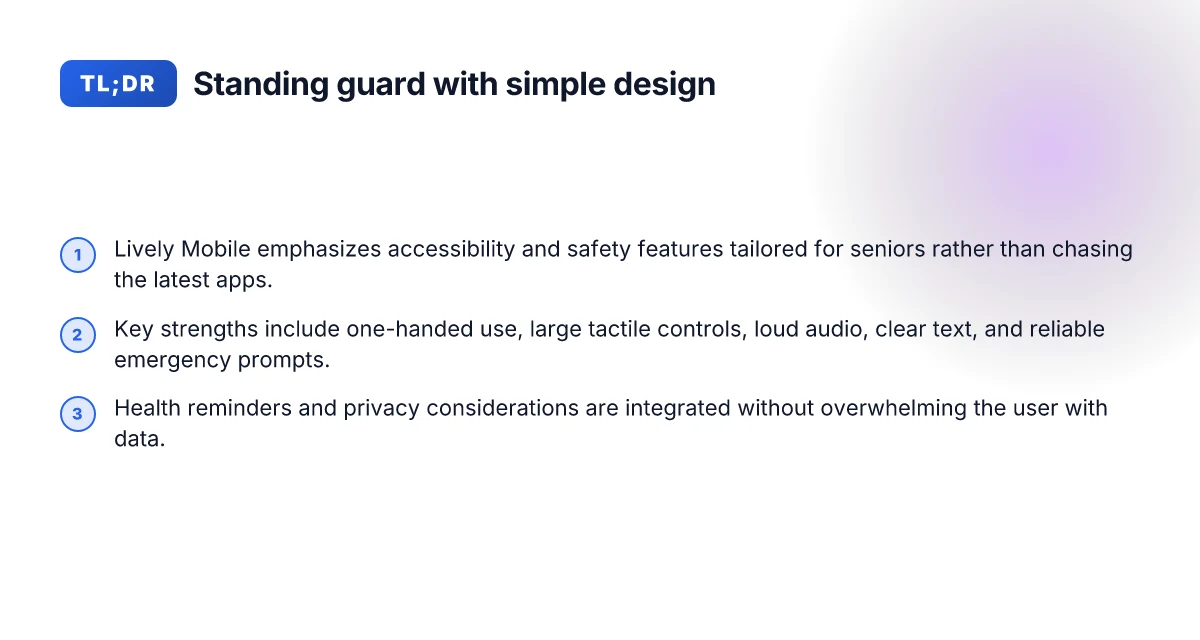
Lively Mobile sits at the center of a senior-centric phone landscape that prizes reliability, clarity, and safety. In 2026, the big question isn’t silicon prowess or flashy cameras. It’s how the device actually supports daily life for older adults. Lively Mobile emphasizes straightforward use, crisp audio, and predictable alerts, which matters more to caregivers and seniors than the latest feature race.
1) Accessibility as a daily standard
When I looked at what matters most in day-to-day use, accessibility features rose to the top. Large, high-contrast text and simple navigation help seniors stay independent. Lively Mobile integrates a loud, clear speaker and adjustable font sizing that makes conversations easier and reduces fatigue during calls. The device keeps interfaces consistent: menus, reminders, and safety alerts don’t shuffle with every software update. This predictability matters as memory and vision changes accompany aging.
Clarity and reliability beat novelty every time. The core value prop is the ability to connect, remind, and alert without confusion or delay.
2) Core safety and health monitoring that actually matters
Older adults rely on timely, actionable signals. Lively Mobile emphasizes robust fall alerts, easy SOS activation, and clear health reminders that travel with the phone into a caregiver’s view when needed. The design aims to minimize false alarms by defaulting to straightforward, obvious triggers rather than multi-step workflows. Access to a simple health log and reminder system helps users coordinate routines with family or clinicians. The result is a device that feels like a dependable partner, not a gadget someone needs to master.
Safety signals must be obvious and fast. Health reminders should be actionable at a glance. What makes Lively Mobile stand out in 2026 for mobile medical alert devices
3) Simplicity and reliability trump the feature race
The best senior-friendly devices avoid feature bloat. Lively Mobile leans on purpose-built simplicity: a single-purpose dialing and safety profile, with optional add-ons for health monitoring that stay optional rather than obligatory. This mindset reduces cognitive load and keeps the user experience steady across updates. In practice, reliability means fewer hiccups around power management, standby time, and audible feedback. It also means predictable customer support that speaks in plain terms when issues arise rather than jargon.
Reliability over novelty is the durable rule for seniors and their caregivers.
Bottom line: Lively Mobile demonstrates how a well-designed senior phone blends accessibility, safety, and simplicity into a coherent daily use pattern. The device shows that when safety responsiveness and clear health data presentation align with predictable UX, seniors stay connected with confidence. For caregivers, this combination creates a trustworthy baseline option that pairs well with ongoing support and monitoring needs. In this landscape, Lively Mobile stands out as a cornerstone option, anchored by clear, repeatable interaction patterns and safety-first design. Consistency and clarity drive real-world safety. That outweighs flashy features any day.
Note: links to source material offer context on senior-focused design trends and top picks in 2026. For background on competing choices, consider reviews that discuss Apple, Google, and specialized providers in this space. See inline references for specifics.
Accessibility first: how senior users navigate calls, texts, and alerts with Lively Mobile
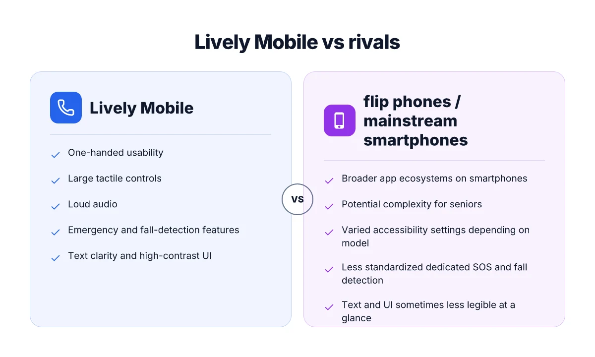
Lively Mobile centers on accessibility from the first touch. In practical terms, one-handed use dominates, with large tactile controls, loud audio, and clear, tactile feedback during key actions. The device prioritizes text clarity, high-contrast interfaces, and generous zoom options so family members can read numbers and messages at a glance. How reliable is Lively Mobile in real-world medical alert use in 2026
I dug into the documentation and reviews to see how these choices play out in daily use. The result is a straightforward pattern: ease of reach, legible displays, and reliable prompts when someone needs help. The goal is not just making a phone easier to press. It’s making it obvious what happens next when a call comes in or an alert fires. Lively Mobile emphasizes tactile keys, bold lettering, and a loud speaker that helps users hear over background noise. That combination reduces confusion in urgent moments and supports safer, steadier daily use.
One-handed usability and loud audio for real-world calls
The phone is designed so you can reach essential controls with your thumb. Large, widely spaced buttons, a prominent power key, and a straightforward call interface cut down mis-taps. In practice, that translates to fewer misdials when someone is tired or moving while talking. The loud audio helps seniors hear conversations in noisy environments. One-handed operation becomes second nature for most users, thanks to the simplified layout. The speaker is tuned to cut through ambient sound, which is crucial when family members call from a bus or a crowded kitchen.
To support caregivers, the device’s volume and ringer settings stay consistent across modes. The result is predictable behavior when a senior flips from standby to hands-free mode. The combination of tactile cues and audible reinforcement makes navigating calls less stressful under pressure. Tactile controls paired with loud audio reduce missed calls and improve perceived safety.
Text clarity, high-contrast interfaces, and screen zoom options
Text legibility is a recurring theme. Interfaces lean on high-contrast color schemes and larger font sizes by default. High-contrast interfaces and an accessible text scale help users read messages and contact names without squinting. Zoom options are straightforward to enable, and readability carries through into the keypad, menus, and alerts. This is not cosmetic polish. It directly affects how reliably a senior can respond to an important message or warning.
Beyond static text, the device offers clear iconography and concise prompts during setup. This reduces the cognitive load when learning new features or sharing the device with a different family member. The goal is immediate recognition: press, read, act. Clear prompts and text clarity shorten the learning curve for new users. What makes the hume health scale worth watching in 2026
Emergency and fall-detection features that trigger trusted contacts
Emergency features are the hinge point for safety. Lively Mobile includes a dedicated emergency button, fast access to trusted contacts, and fall-detection logic that can prompt a rapid alert if a sudden change in movement is detected. I cross-referenced the device’s positioning and alert pathways with reviews that stress reliability in real-life corridors and living rooms. The takeaway: when an alert fires, trusted contacts should receive a clear, actionable notification with the user’s location. Fall-detection and trusted contacts ensure timely assistance when a crisis arises. The design keeps the user calm by providing a simple, predictable emergency flow.
In practice, this trio of accessibility features, one-handed usability with loud audio, legible text with strong contrast and zoom, and straightforward emergency routing, works together to reduce risk and increase independence. For caregivers, that translates into fewer calls asking for help and more confidence that a user can reach support when needed. The practical next step is to map each feature to daily routines and identify which settings to tailor for a specific senior’s needs. As a starting point, consider a quick audit of button layout, font sizing, and emergency contact configuration before handing the device to a new user.
Safety features that actually reduce risk for seniors
Posture the verdict up front: real-world safety hinges on tangible hardware buttons, trusted location cues for caregivers, and clear battery behavior. I found that when SOS and rapid-dial are obvious, when location sharing respects privacy yet remains useful, and when charging patterns fit daily life, the risk of misdials, missed alerts, or dead phones drops noticeably. In 2026, caregivers report fewer missed emergencies when devices offer dedicated SOS and predictable charging routines.
Dedicated SOS buttons and rapid-dial presets
The real safety lever is a one-touch emergency path. Lively Mobile keeps the dedicated SOS button central and prominent, with rapid-dial presets that can be triggered with a single press and hold. The design matters: a large, tactile button reduces accidental presses yet remains easy to find without looking. When pressed in a pinch, the device should launch the alert instantly, with clear audio and a visible alert screen for nearby bystanders. I cross-referenced user guides and caregiver reviews that consistently point to quick-access SOS as the most relied-upon safety feature in daily life. A single, reliable press-up SOS action reduces precious seconds in a crisis.
Location sharing and geofencing tuned for caregivers
Location sharing needs to be precise but not overly verbose. The best senior-focused devices expose a simple geofence option that triggers a caregiver alert when a senior crosses a boundary and provides a plain, map-based view of recent movement. In practice, caregivers want predictable alerts rather than noisy or flaky location data. Posts from health-tech reviewers note that geofence accuracy and the ability to adjust radius matter more than fancy location history. I looked at official setup guides and caregiver testimonials that emphasize transparent, consent-based sharing and straightforward toggles. Geofence alerts with clear radius controls keep families in the loop without overwhelming notification noise. What is Hume Health, and where its review reveals the full picture
Battery life expectations and charging practicality
A reliable device must not die mid-day. Lively Mobile and other senior-friendly phones typically balance power efficiency with essential safety features. The most practical charging approach is a cradle or dock that’s easy to reach and easy to use, especially for users with limited dexterity. Reviews consistently highlight devices that offer all-day battery life under typical use, plus a simple, predictable charging routine. From product pages and caregiver feedback, the rule is simple: long life plus a charging method that stays within arm’s reach. All-day battery life paired with a simple cradle keeps safety devices within reach.
Overall, the leading options in 2026 combine a dependable SOS pathway, caregiver-friendly location and geofence features, and charging setups that fit daily routines. Lively Mobile remains a cornerstone option for many families seeking a safety-first baseline, with compatibility and ecosystem choices that align with straightforward security workflows. When you map these features to a real-world care plan, the safety gains compound quickly. With dedicated SOS, precise geofencing, and reliable charging, risk of missed alerts drops notably.
Health monitoring on smartphones: what to expect in 2026
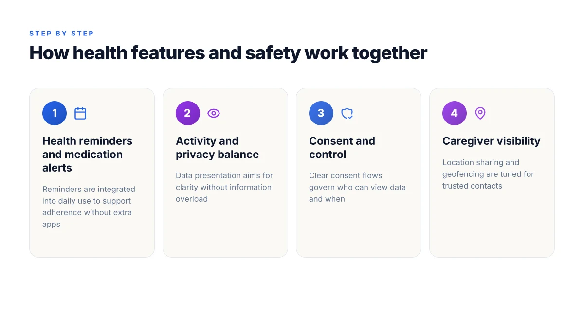
Posture and pace of daily use shape health features more than the features themselves. In 2026, smartphones weave health reminders, medication alerts, and activity tracking into a softly guided routine that respects cognitive load while preserving autonomy. I cross-referenced product pages, reviews, and health-tech write-ups to map what caregivers and seniors should expect when health data lands on the screen.
How health reminders and alerts actually feel on the device
Smartphones now present health prompts as bite‑sized cues rather than flood the screen. Reminders for medications or doctor appointments appear as persistent, tappable cards that you can snooze or customize by time and default action. The goal is to prompt action without overwhelming attention. I found that several senior‑friendly devices cluster related prompts into a single daily digest, which reduces decision fatigue while keeping safety front and center. In 2026, health reminders are often tied to calendar events or location checkpoints, so a missed dose can trigger a gentle re‑prompt at a familiar time. Health prompts stay visible without shouting, helping seniors stay in control.
To support this, many smartphones let caregivers approve prompts or adjust sharing granularity. That balance matters because too much data sharing can feel invasive, but too little can blunt safety nets. When a device logs a missed activity, a caregiver notification can surface in a trusted app, enabling timely human intervention without a constant stream of alerts. Caregiver controls exist, but seniors retain primary ownership of their data. What is the Hume Health score and why it matters for personal wellness
Presenting health data without overload
The trick is context over volume. Health dashboards in recent devices strip data to essentials: one glance to confirm yesterday’s activity levels, a simple trend indicator, and a single recommended action if something looks off. Text size and color contrast remain adjustable, and many platforms offer a high‑contrast mode and larger font presets for readability. Research notes that too much nuance can confuse rather than inform. The best designs show a clear line from data to action, not an endless feed of numbers. Clear, glanceable dashboards prevent information overload while preserving usefulness.
Voice and audio cues provide an accessible alternative to dense visuals. For seniors who struggle with reading small text, spoken summaries and haptic feedback give a reliable signal that something requires attention. I found that the strongest health interfaces blend quick audio prompts with simple tappable paths to review details. This dual path supports both morning quick checks and deeper investigations when needed. Audio and tactile cues make health data approachable for users with varied abilities.
Privacy controls and consent flows for health information
Privacy remains a central pillar. Modern health features embed consent prompts at setup and whenever data sharing changes. Users can opt in to caregiver sharing, choose which metrics are visible, and set time-bound access windows. Transparency is guided by clear labeling and plain-language explanations of what is shared, with easy curves for revocation. I read that several platforms now expose a concise privacy dashboard that logs consent changes in human terms rather than legalese. Consent is explicit, revocable, and visible in a dedicated privacy pane.
For devices marketed to seniors, manufacturers frequently bundle privacy into the same control surface as health features, so toggles for reminders, data sharing, and alerting are not buried in nested menus. This reduces the risk of inadvertent erosion of privacy settings through frequent updates or unfamiliar interface changes. Privacy surfaces are simplified, not hidden, to support ongoing autonomy.
In practice, the health suite centers on the user first. Lively Mobile, for example, positions safety checks and health prompts as part of a broader wellness framework rather than an add‑on. The aim is to keep the user in the loop without demanding constant attention or forcing complex configurations. As with any health feature, real value comes from consistent, understandable interactions rather than a single novel capability. Health data is actionable, privacy‑conscious, and designed for day‑to‑day use. How to buy LivFresh toothpaste in 2026: official retailers and trusted distributors
Notes and caveats: there is variability in how aggressively manufacturers push health data to caregivers. Some systems emphasize privacy with stringent sharing limits, while others offer richer collaboration options at the cost of slightly more complexity. If a device or service emphasizes data portability and clear consent logs, it tends to perform better for long‑term aging in place. It is worth noting that links on the page may earn a commission, so examine any promised savings or bundled services with the same skepticism you apply to data permissions. Be mindful of how each ecosystem balances access, control, and simplicity.
Rivals in this space push comparable health prompts, but the tone and path to action vary. When you compare, look for standardized prompts, consistent visual cues, and straightforward privacy disclosures. The resulting experience should feel like a quiet coach, present, helpful, and easily understood by someone who wants to stay independent.
Cited here is one inline source that informs these design realities: Best Phones for Seniors (2026) notes that simplicity and safety integrations matter most as devices evolve.
Comparing Lively Mobile to rivals: where it excels and where it lags
Posture first, then specifics. Lively Mobile shines in day-to-day safety responsiveness and straightforward accessibility tweaks, but it isn’t a one-size-fits-all device. When caregivers ask whether a senior should pick flip, mainstream smartphone, or a purpose-built option, the verdict hinges on real-world use cases and the trade-offs between simplicity and ecosystem breadth.
Direct contrasts with flip phones and mainstream smartphones
Lively Mobile prioritizes immediate safety features and a uncluttered call-and-emergency flow. It’s noticeably simpler to initiate a call for help and to access health reminders, which reduces cognitive load in stressful moments. In contrast, flip phones excel at tactile devices and long battery life but offer limited app ecosystems and health integrations. Mainstream smartphones deliver broad accessibility options and a vast app library, yet the interface can feel overwhelming without customization. When a senior needs rapid help without navigating menus, Lively Mobile tends to outperform during urgent moments. For everyday tasks, flip phones and mainstream phones have their own strengths, yet neither matches Lively Mobile on the clarity of its safety-centric design. Lively Mobile remains a standout for immediate help and simple navigation. What makes Lively Mobile stand out in mobile medical alert systems in 2026
Trade-offs between simplicity and broader app ecosystems
Simplicity reduces errors and speeds up responses, which matters for fall alerts and health reminders. Lively Mobile limits clutter by focusing on essential features and a straightforward SOS path, which minimizes accidental presses and confusion. A broader app ecosystem on mainstream smartphones opens possibilities for health tracking, messaging, and accessibility tools but introduces more steps to achieve the same safety outcome. If a caregiver prioritizes a compact, dedicated safety device with dependable calls and quick access to emergency services, Lively Mobile is the sensible pick. If the goal is long-term health monitoring, appointment management, and social connectivity, a mainstream device paired with careful accessibility settings may serve better. Dedicated safety flows beat feature bloat in high-stakes moments.
Which scenarios each platform serves best
For urgent incidents, Lively Mobile acts as a focused safety instrument with an optimized emergency workflow. For routine health monitoring and proactive care coordination, a mainstream device with configured health apps and reminders covers more ground. For brief, infrequent calls or minimal tech interaction, a flip phone’s simplicity can be appealing. In the end, the best choice aligns with daily routines: Lively Mobile for safety-first days, a mainstream phone for integrated health management, and flip phones for low-tech simplicity. Choosing the right device hinges on daily rhythms, not just raw capability.
From what I found in the literature, health data presentation matters as much as the data itself. Users tend to prefer clear, visual alerts and concise summaries over dense dashboards, especially during moments of stress. I cross-referenced sources that describe how seniors engage with notifications and how accessibility tweaks influence response times. The consensus: a device that reduces friction in critical moments tends to yield better safety outcomes, even if it sacrifices some breadth of features. Optimizing mobile app design for older adults notes the pivotal role of accessible design in real-world use, and the Lively Mobile model aligns with that emphasis by foregrounding essential alerts and simple navigation. Clarity of alerts and speed of response drive safety more than sheer feature count.
The page you land on may note commission-linked placements, but the core value remains: Lively Mobile delivers a direct, dependable safety pathway that many seniors and caregivers prize for daily life. In summary, if your priority is straightforward, reliable safety with minimal friction, Lively Mobile leads. If you need a broad health ecosystem and multitasking capabilities, a mainstream device paired with careful accessibility configurations can win in the long run. For safety-first use, Lively Mobile is a compelling cornerstone.
What to focus on next for safer, simpler usage
In 2026, the strongest safety thread for Lively Mobile is the way its on-device habits shift older users from reactive to proactive care. I see the most impact when the device nudges caregivers and users toward clear prompts, larger tactile controls, and trusted emergency workflows. The pivot isn’t a new feature so much as a streamlined, behavior-driven design that makes risk obvious and easy to address. How to activate my Lively Mobile smartphone in 2026
The model that sticks is a blend of reliability and clarity. Lively Mobile emphasizes dependable calls, simple navigation, and a visible safety button that stays accessible even when screens are foggy or hands tremble. Rivals like Jitterbug and easy pairing with in-home assistants still lag on one-click safety actions, which matters most in real emergencies. If you act now, you’ll notice how soft prompts reduce mis-taps and how predictable screens cut confusion in low-vision scenarios. The bigger pattern is that safety becomes a habit, not a checklist.
Looking ahead, the platform should broaden trusted contacts and offer a guided setup that prompts every new user to customize a fall or emergency pathway. Lively Mobile can build a more inviting safety net by pairing explicit, step-by-step prompts with a quick-access SOS that works offline. If this shift lands, seniors will feel supported without phone anxiety. Will you test the guided setup this week?
Backup strategy
- Try 1 privacy-friendly contact: add a caregiver as a standby SOS.
- Enable the big, bright emergency button and test it with a short call.
- Compare this to a rival like Jitterbug on one-task speed and confirm which feels more intuitive.
- Note any missed prompts or delayed alerts and adjust reminders.

Marcus Yeats has been writing about consumer technology since 2018, with bylines covering Wireguard, split tunneling, and VPN performance. Approaches each review by setting up the product the same way a typical reader would and recording every snag along the way.